Libraries are cornerstones of our communities as hubs for knowledge, research, history, and so much more. They are places where people can connect with others and invest in their own future. We know that libraries are a huge resource to every community, but how about our online communities?
Your library’s website isn’t just a website, it’s an entirely separate branch of your library system. As such, it’s important to give your patrons an online experience with the same value as they would find walking through the doors of their local library. It should be clean, vibrant, and accessible to all. It should be a place where information and resources are easy to locate, with the newest and most popular things offered right up front. It should be a place that your patrons feel excited and happy to use. It’s more than a website, it’s your digital library branch.
With that in mind, we’ve gathered some of our favorite library websites that showcase some of the best aspects of a great digital library branch. Below, you’ll see a roundup of some of the best websites in some of the following categories:
- Functionality
- Responsiveness
- Accessibility
- Aesthetics
- Ease of use
- Great brand consistency
1. Saint Paul Public Library
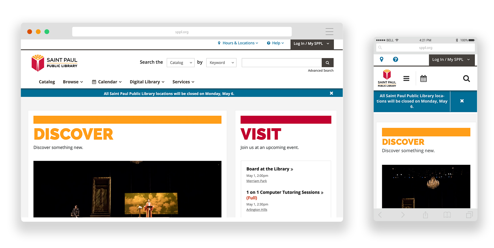
- The robust, advanced search function: You can search the catalog, website, FAQs, or events and narrow your search even further by choosing keyword, title, subject, series, tag list, or user.
- It’s modern, clean, and colorful: Very inviting and the use of color helps to successfully organize the content for users.
- The CTA’s under “Browse Books” which include Book Clubs, Book Club in a Bag, Get Reading Suggestions, and NoveList Plus.
2. Seattle Public Library
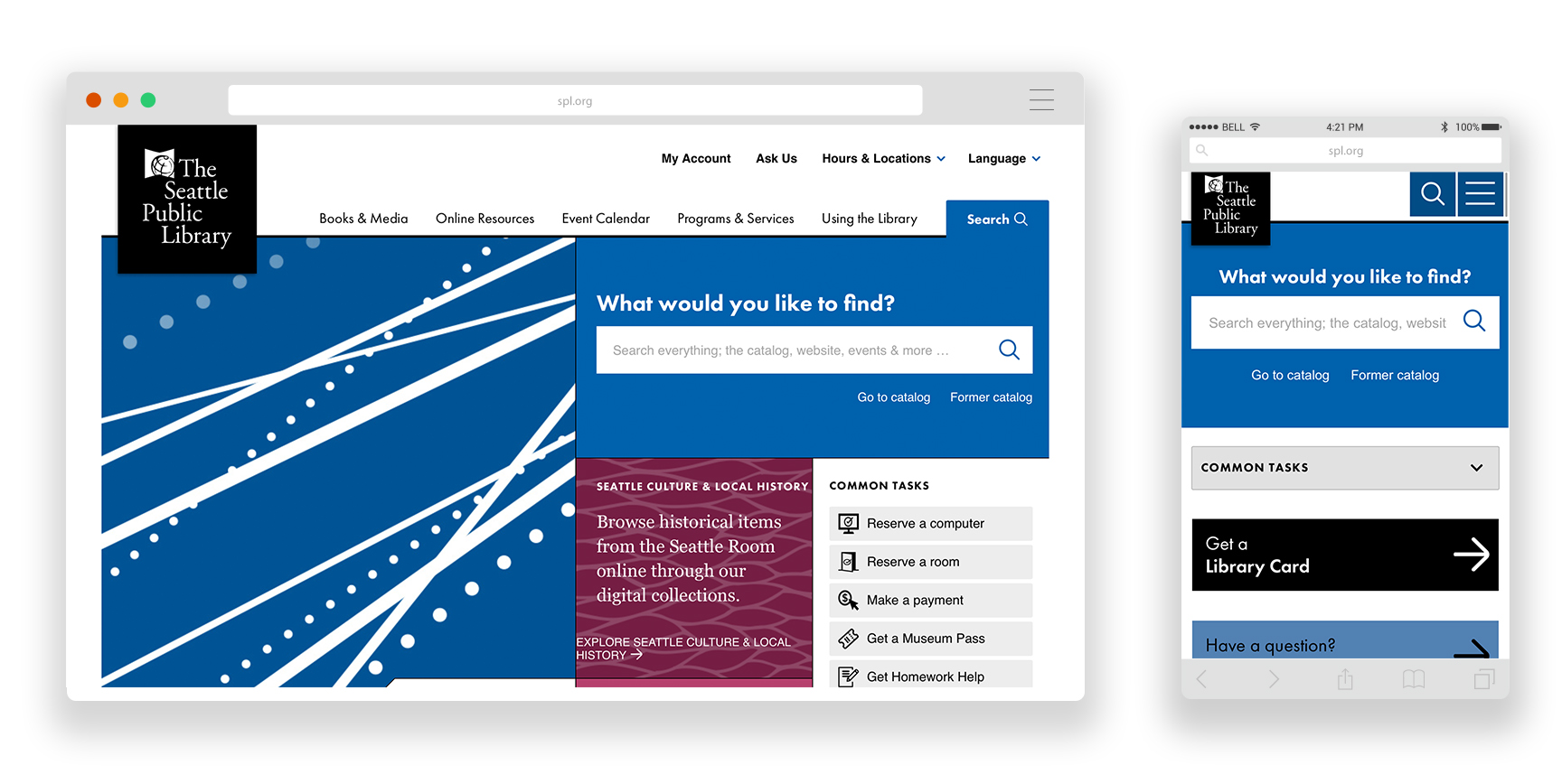
- The events calendar. We love the search and filter sidebar and the monthly view is useful to find events on specific days. Additional filtering allows you to search by keyword, event type, author readings/lectures, book group, class, homework help, and location.
- Modern, modular look. The colors are mostly neutral with pops of color to draw the user in further.
- It’s easy to find what you need. The main nav is sectioned into different tabs, and the search tab is very accessible. The “common tasks” section is great for getting users directly to the content they might be looking for without further searching.
- The staff picks book section and how there are different categories to choose from.
3. Clifton Park Halfmoon Library
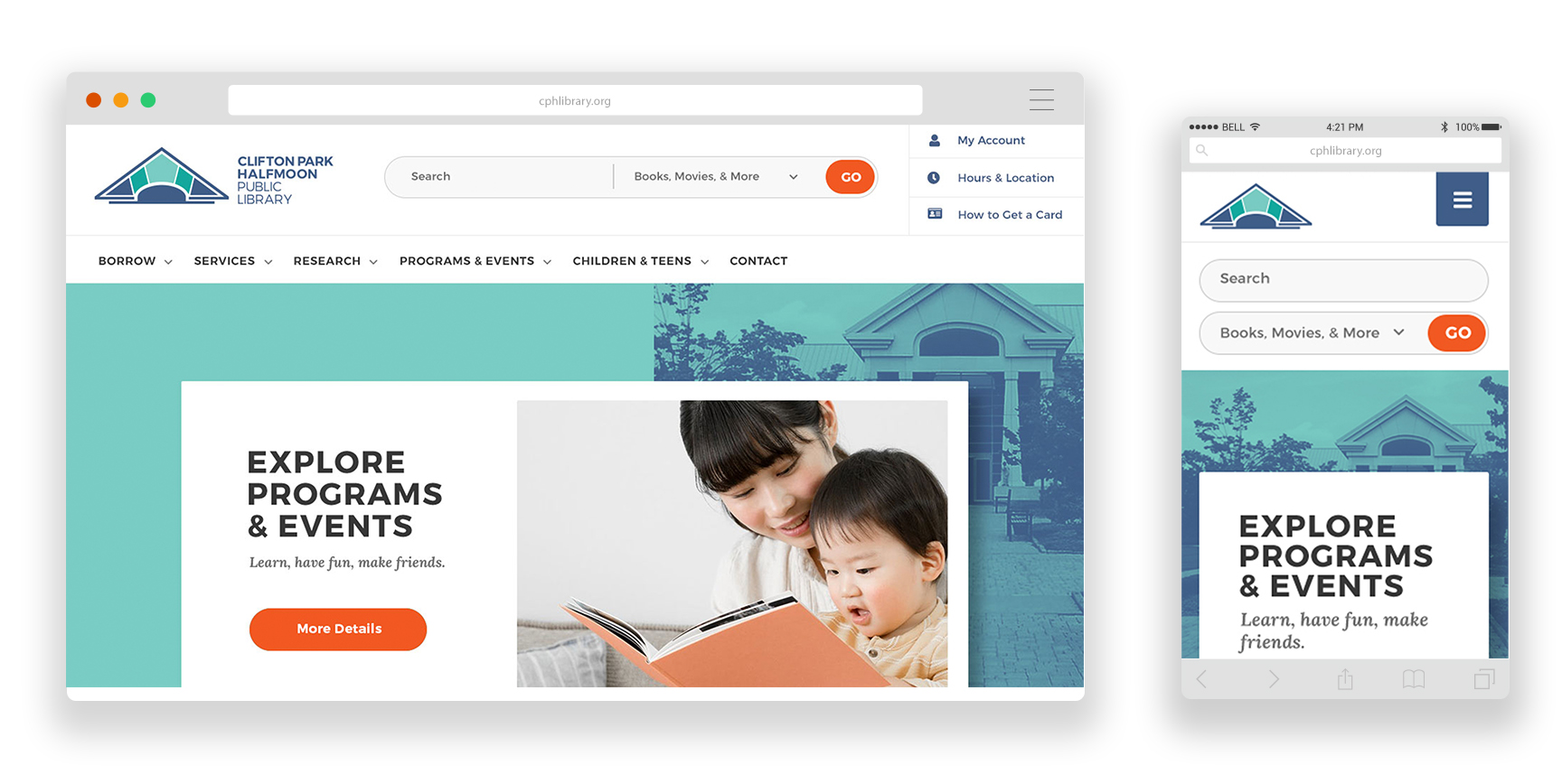
- The search function. They feature a robust search function that allows users to filter between books, movies, events, and websites.
- The events calendar. The Programs & Events drop down menu lets the user search for all events, events for children, teens, and adults, view the program brochure, or suggest a program. Once you make a selection, you are taken to a weekly calendar that shows you all of the events happening that week.
- It’s modern, clean, colorful. The use of patterns and textures gives the whole website a cohesive look.
- The quicklinks in the top right corner allows for quick and easy access. We love how the mobile menu is divided into “Quick Links,” “Menu,” and “How Do I?”
- The digital content iconography on the homepage. It’s creative and eye-catching!
4. Ann Arbor District Library
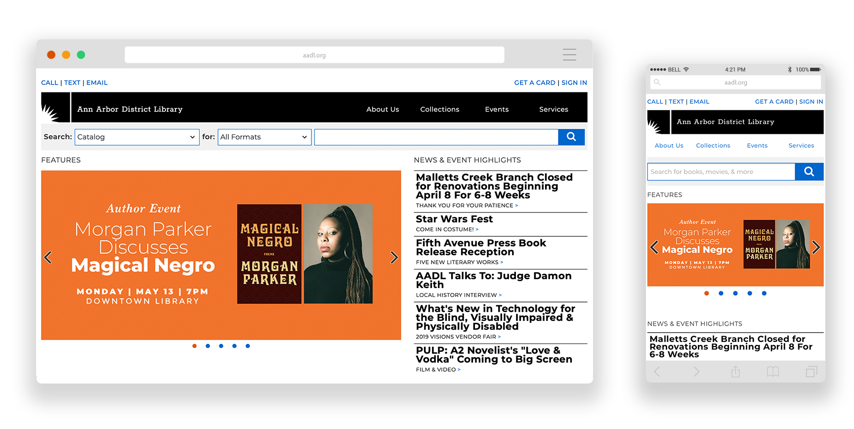
- The robust, advanced search function. You can search the catalog by author, title, subject, or call number. There are also options to search Community Collections or the website and narrow your search even further by specific formats.
- The main nav is sectioned into different tabs, and the search tab is very accessible. The “common tasks” section is also useful to have on the homepage because it doesn’t require any further searching.
- The “Explore Local History” collection on the homepage. It allows users an easy way to find out information that otherwise could be challenging to access.
Need an affordable solution to make your library website amazing?
Check out a demo for Piola, the first Digital Library Branch.
5. New York Public Library
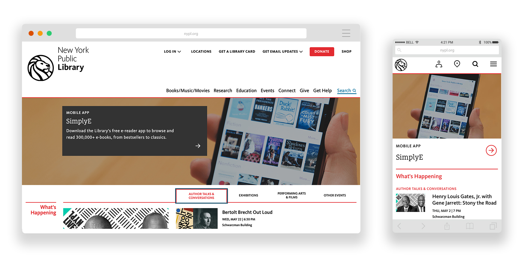
- The events calendar. It’s very clean and easy to navigate. You can select upcoming events, exhibitions, author talks & conversations, and performing arts & films. You can select to see more of each type of event and be taken to a new page that sorts the events by “on now,” “coming up,” and “archives.”
- The modern, clean look. The color red is used purposefully to draw the user’s eye.
- The location finder. Users can view locations in either a list format or a map view. They also have the option to search for libraries near them or research libraries. Library location info includes accessibility information, highlighted amenities and the hours for that day.
- The short comments about books in the staff picks section is personal and fun.
6. Brookline Public Library
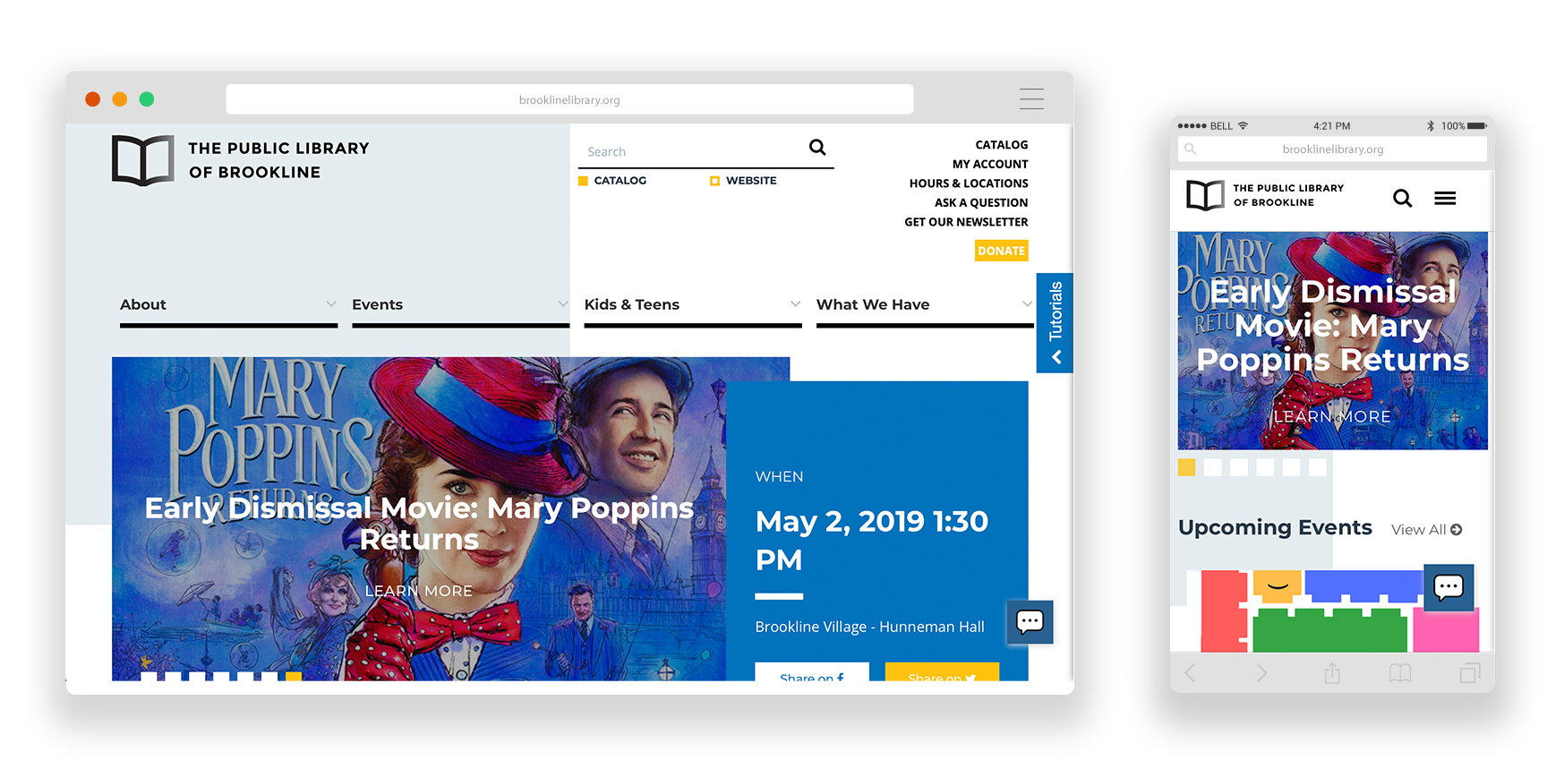
- Simple but successful search function. Users can filter between the catalog and the Brookline Public Library website.
- The events calendar allows the user to filter between calendar events for children, tweens, teens, and adults, special events, and ongoing events.
- Bright and colorful which makes for an inviting site. Many libraries use color to appeal to many audiences, which makes the online experience more inviting and accessible.
- The chat line which makes it easy for users to get answers to any questions they might have.
7. Salt Lake City Library
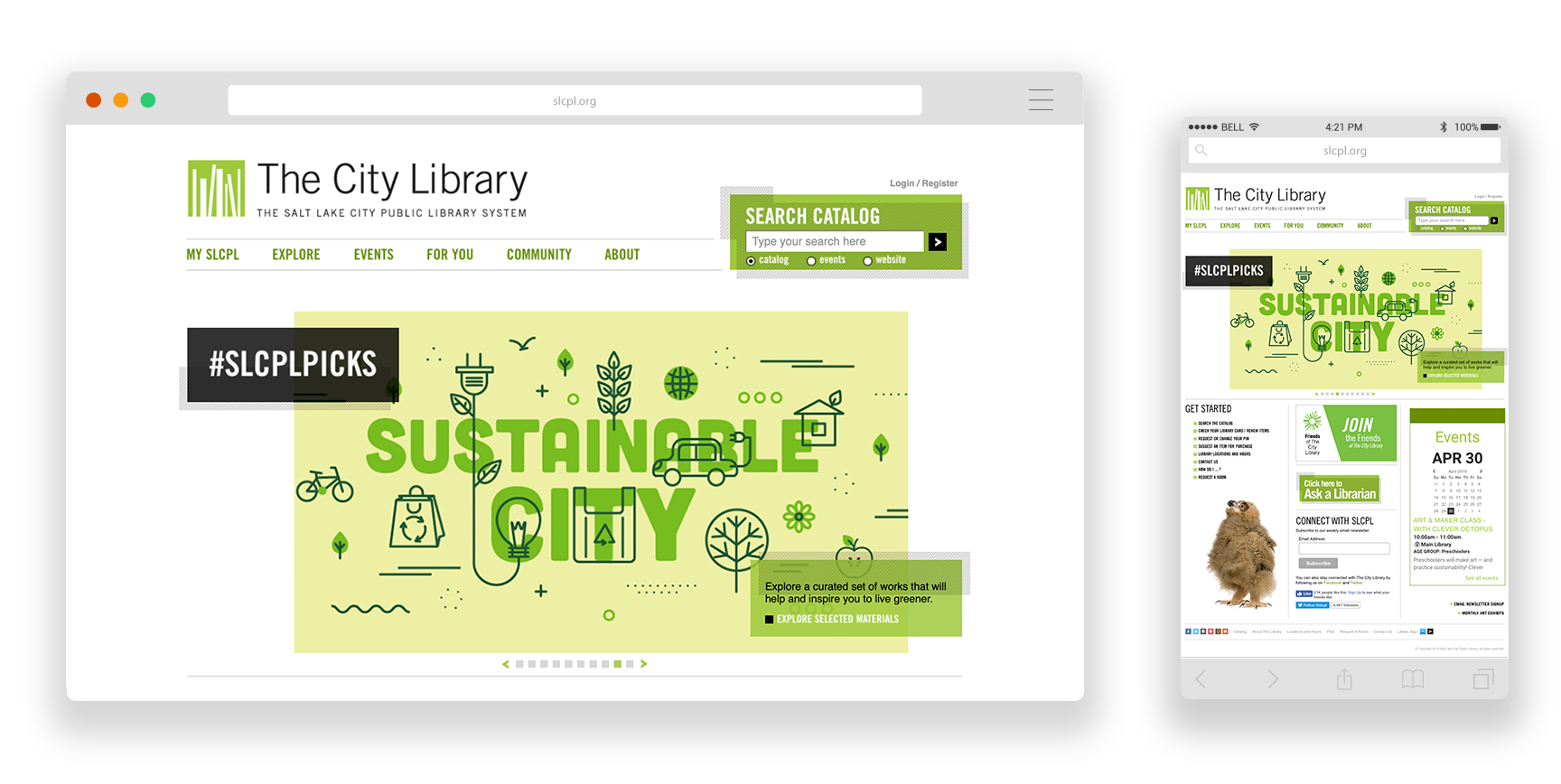
- The search function. The simple but effective search function allows user to filter search by catalog, events, and website.
- The customizable search function for events. Users can filter by location, age group, event type and date. Events are color coordinated for age groups to make it easy to understand at a glance.
- The modern, clean, simple look. The use of the color green gives the website a cohesive look.
8. Oak Park Public Library
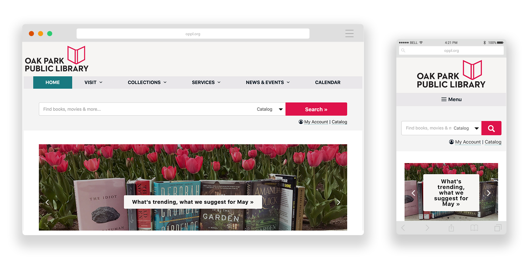
- It’s responsive. While most good websites are responsive these days, we particularly liked this mobile experience that was equally successful on all devices.
- The main nav is sectioned into different tabs, and the search tab is very accessible. The “common tasks” section is great to have on the homepage because it doesn’t require any further searching
- The short homepage that gets right to the point. It shows a few upcoming events, most recent news, suggested books/audiobooks/movies, and digital library content. Less content makes for a cleaner, more inviting homepage.
9. Library of Congress
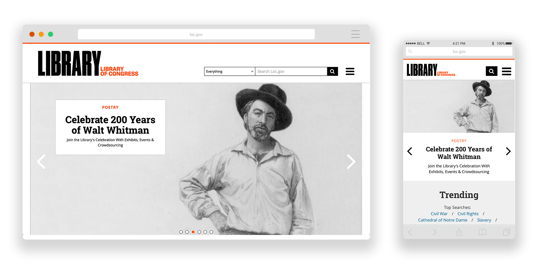
- The robust search function. Users can filter between Audio Recordings, Books, Films, Legislation, Manuscripts, Maps, Music, Newspapers, Periodicals, Photos, Web Pages, etc.
- The events calendar. We love the search and filter sidebar. The monthly view is useful to find events on specific days. Additional filtering allows you to search by keyword, event type, author readings/lectures, book group, class, homework help, and location.
- The simple and straightforward look that makes use of old photographs to give the website a vintage feel.
- It’s easy to view and use. Even on desktop, the main nav is collapsible in a hamburger nav. This keeps the look cohesive across all devices.
- The “Free to Use and Reuse” section on the homepage. The trending top searches is an interesting feature we haven’t seen on many other sites.
10. Harrison Memorial Library
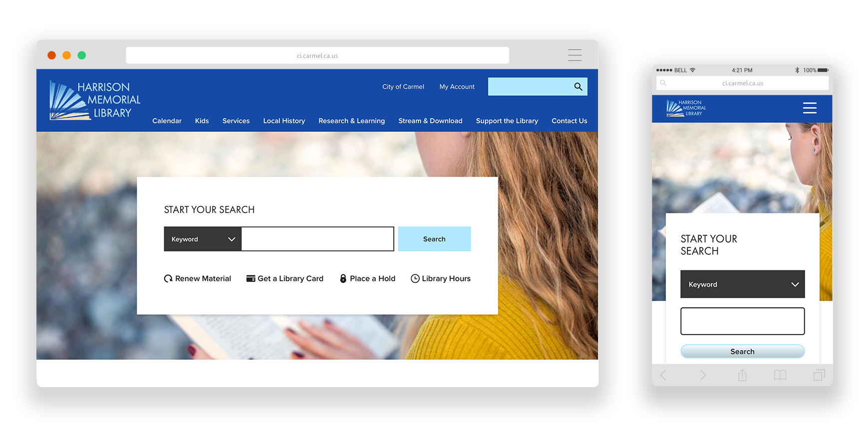
- The search function. The centered search bar (for books, movies, & more) means you can’t miss it. The drop down allows you to search by keyword, title, author, call number, ISBN, subject, or series. We love the CTA’s below the search bar: renew material, get a library card, place a hold, and library hours.
11. Vancouver Public Library
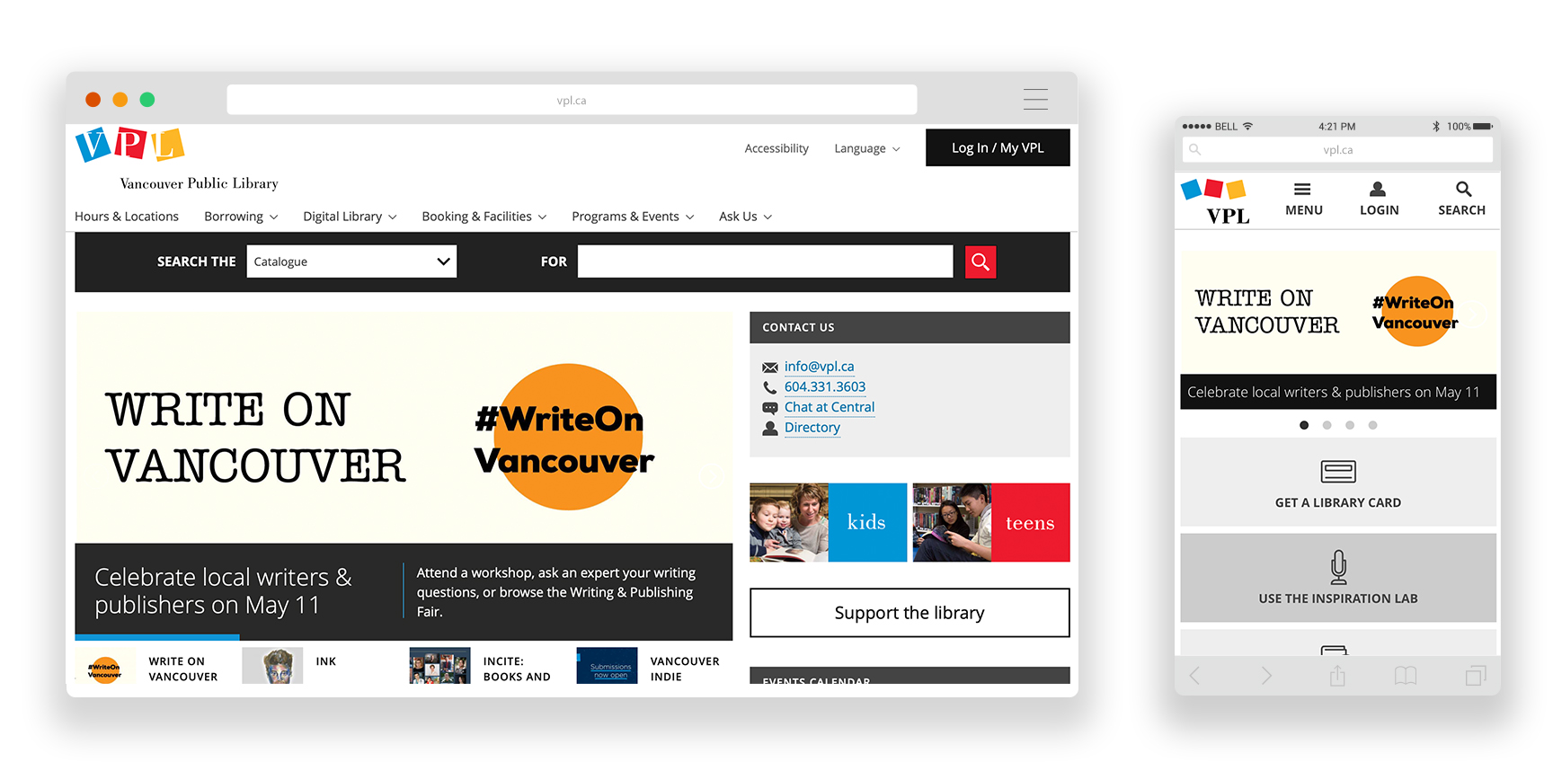
- It’s responsive and offers a very clean mobile version of the site, excessive content is hidden in favor of simple organization.
- The simple search function which allows users to filter the search between catalog, events, and website
- The events calendar notes which events are currently in progress at the time of search.
- The search is prominent across the tops of the homepage and large buttons with icons help users move quickly to popular areas of the site.
12. Downey City Library
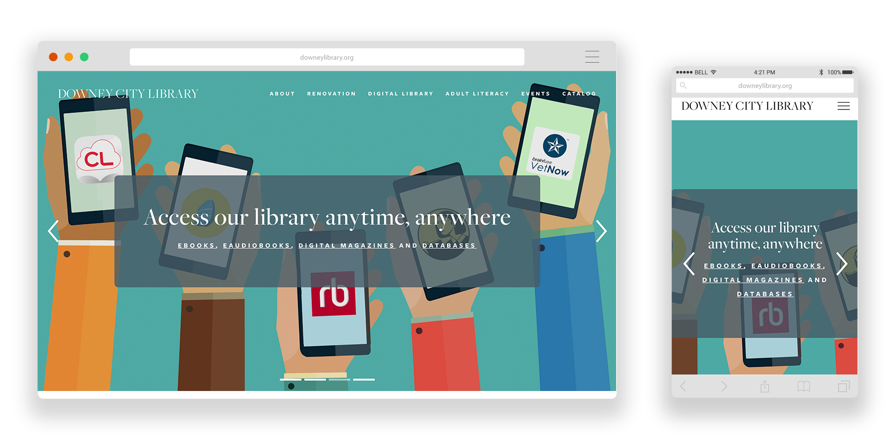
- Large well-designed hero image that grabs your attention and cycles through the most important announcements.
- Digital services offered right up front, prominently displayed on the homepage. This is crucial for a library’s website, as it is the hub for your digital services. Just like how a patron sees shelves books immediately when they walk into your library, you want them to see digital content right when they enter the website.
13. Richmond Public Library
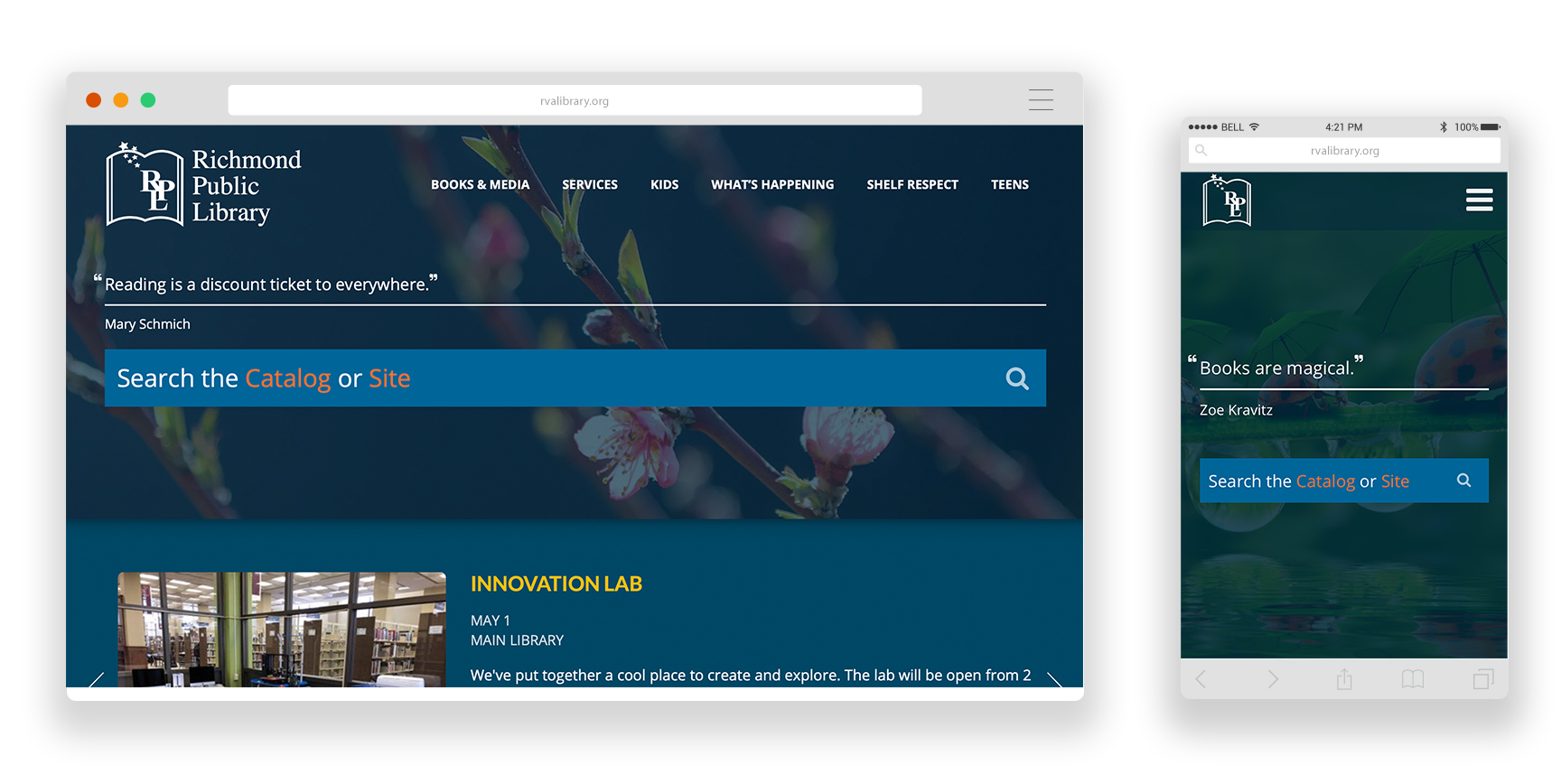
- Large search bar offered prominently on the homepage. Option to search both the catalog and the site.
- Clean, simple design with great use of color to draw users to certain areas of the site.
- The hero section never changes, and contains the search, but below the hero there is a smaller section with a rotating banner that displays newsworthy announcements. We love that this library opted for a consistent hero right at the top of the homepage to provide users with predictability and easy navigation!
14. Central Arkansas Library Systems
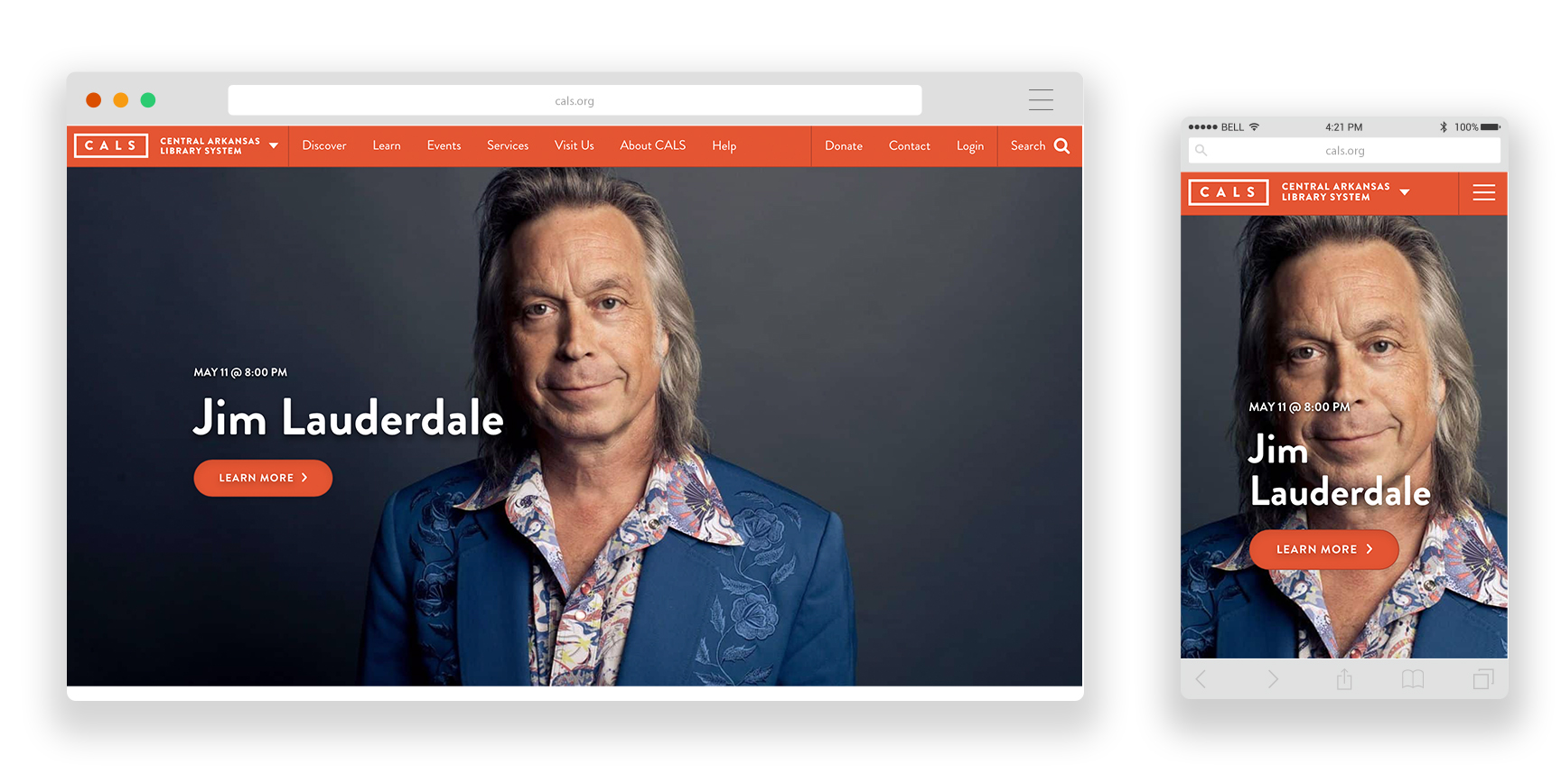
- Fully responsive and easy to use on mobile.
- Clean attractive design. Good use of colors for brand consistency. Plenty of white space, making it easy to read. Great use of brand consistency throughout the site.
- One upcoming event featured at the top without a changing slider. Additionally, three events are offered right at the top of the homepage with 3 featured events. The simplicity makes it clear for users to see which events might be most popular to attend.
15. Indianapolis Public Library
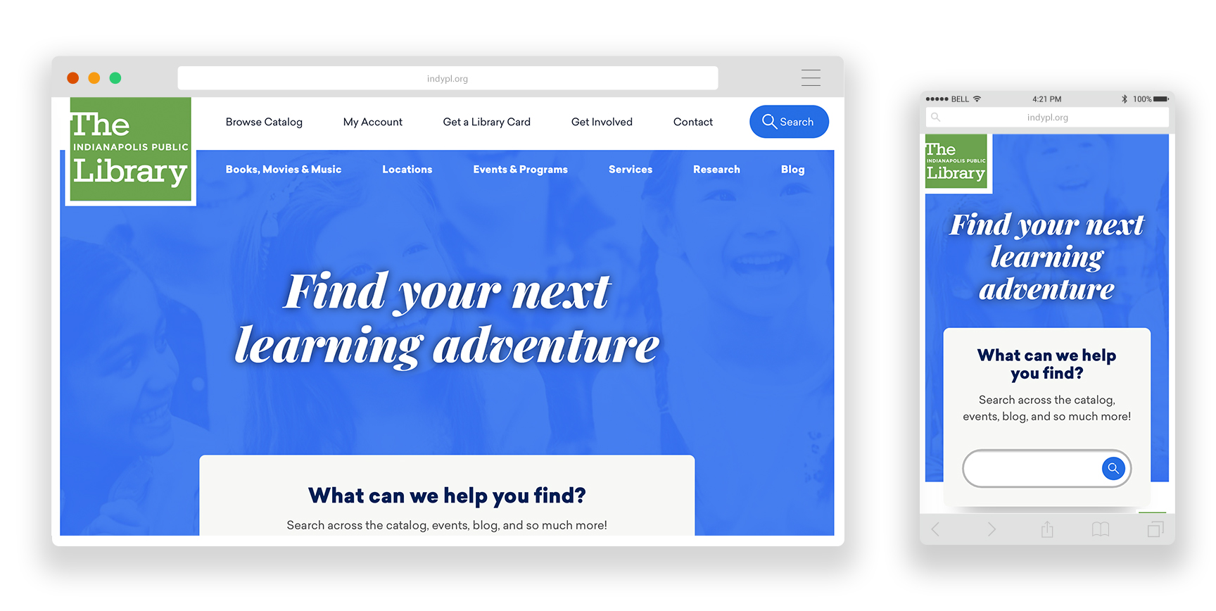
- Search is offered right up front in the hero. Results are very comprehensive and return results for catalog, events, blog, website, research, and Digital Indy archives.
- Extensive events calendar with filters for location, event type, age group, date, and time.
- Clean design with plenty of white space to make it easy to read.
- The mobile version offers a bottom nav with quicklinks and a menu, which makes the mobile experience feel more like an app than a website. Very cool!
16. Boston Public Library
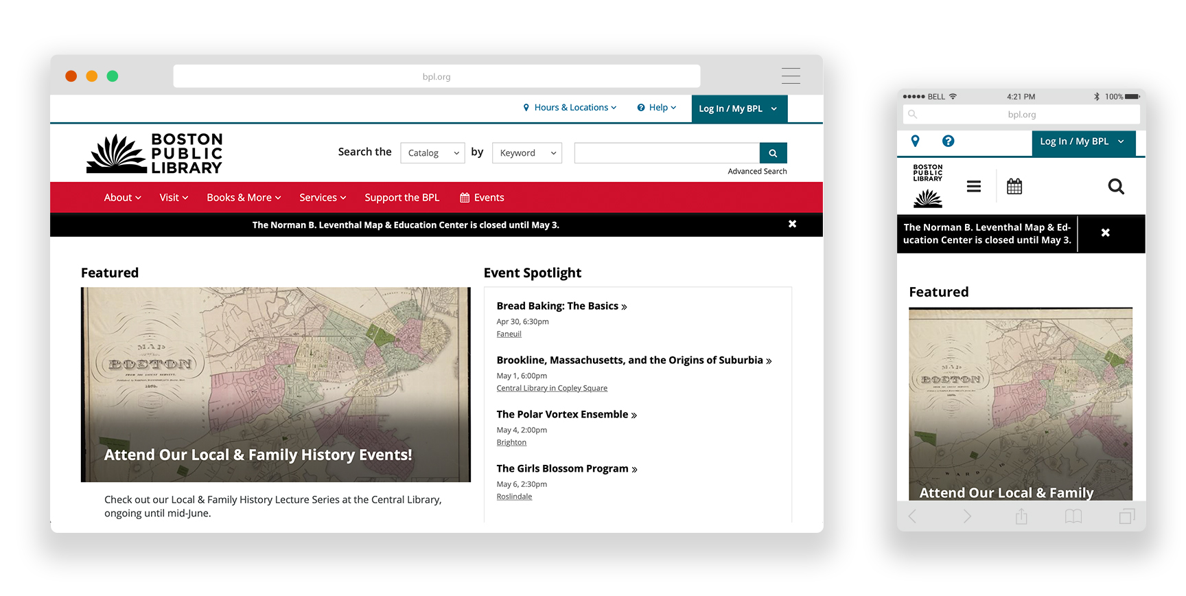
- Fully responsive with collapsed nav. Boxed content makes it easy to scroll on mobile.
- Prominent search offered right at the top with options to search catalog, website, events, and FAQs.
- Comprehensive event calendar search with filters for date, location, event type, program name, and type of audience.
17. Albany Public Library
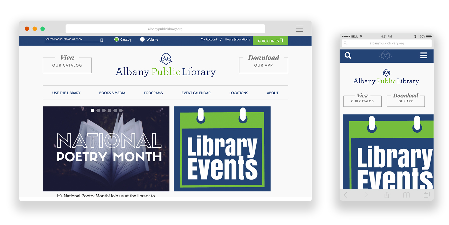
- The events calendar. They offer different event calendars based on branch or age group.
- Great use of colors for brand consistency along with a clean, attractive design.
- CTA’s right at the top to “view our catalog” or “download our app”. They contribute aesthetically to the site, but also provide a clear action for users to take.
18. Newport Public Library
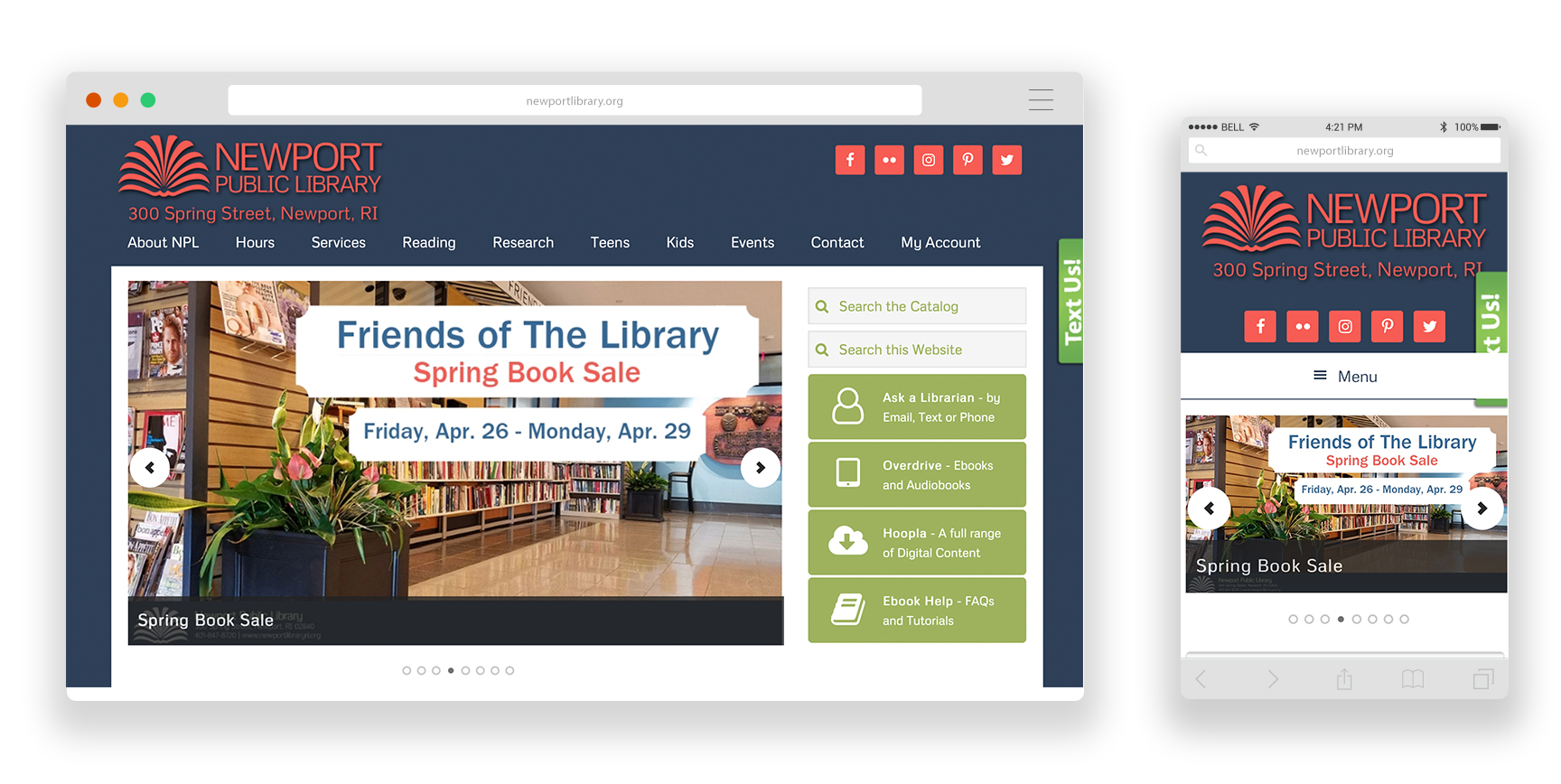
- Simple and colorful, easy to find what you are looking for. Great brand consistency across the site with use of colors.
- Dropdown nav helps create a clean and simple look and makes information easy to find.
- Quicklinks for a few digital services offered right under the search. Streamlines the navigation of the site and directs users to those services.
19. Omaha Public Library
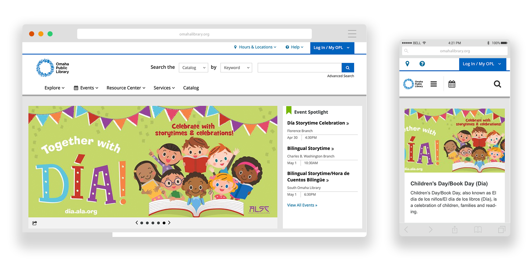
- Use of colors to distinguish between main menu items helps you focus on each one, especially on desktop.
- Location drop down allows user to quickly navigate to their preferred library branch, or view all locations, as well as the ability to select a specific day.
- Their mobile app and the use of a featured website page dedicated to download instructions and benefits of using the app.
20. Houston Public Library
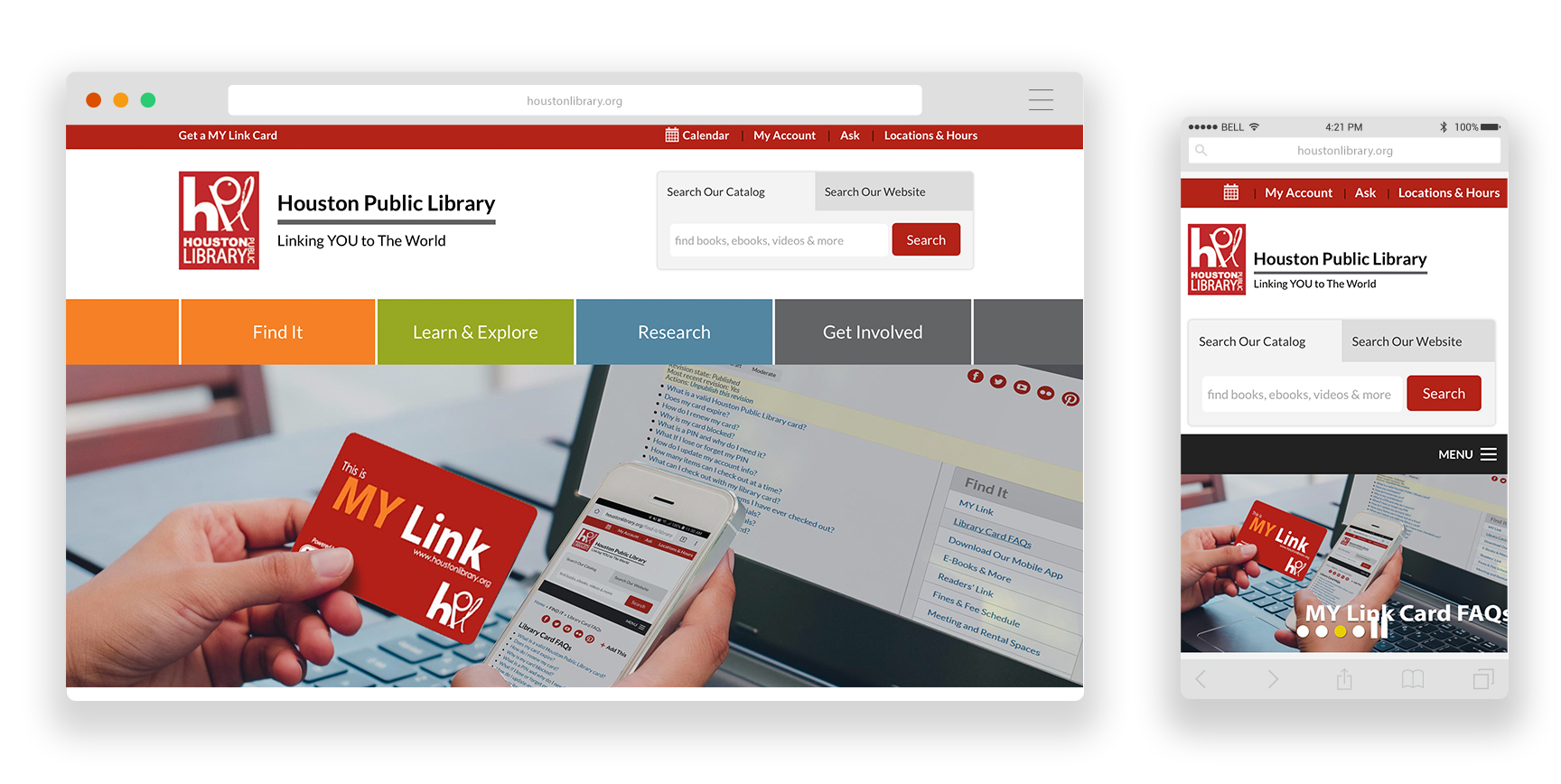
- The simple, prominent search function allows you to search the website or the catalog.
- Brand consistency. Red color found in the logo is used throughout the site’s style without being overwhelming.
- Use of images in the mega menus of the main nav help visually break up the items found under each menu item.
- The location search allows you filter locations by “open now”, “open tonight”, and “open weekends.” This is very unique, and very useful!
21. Cumberland Public Library
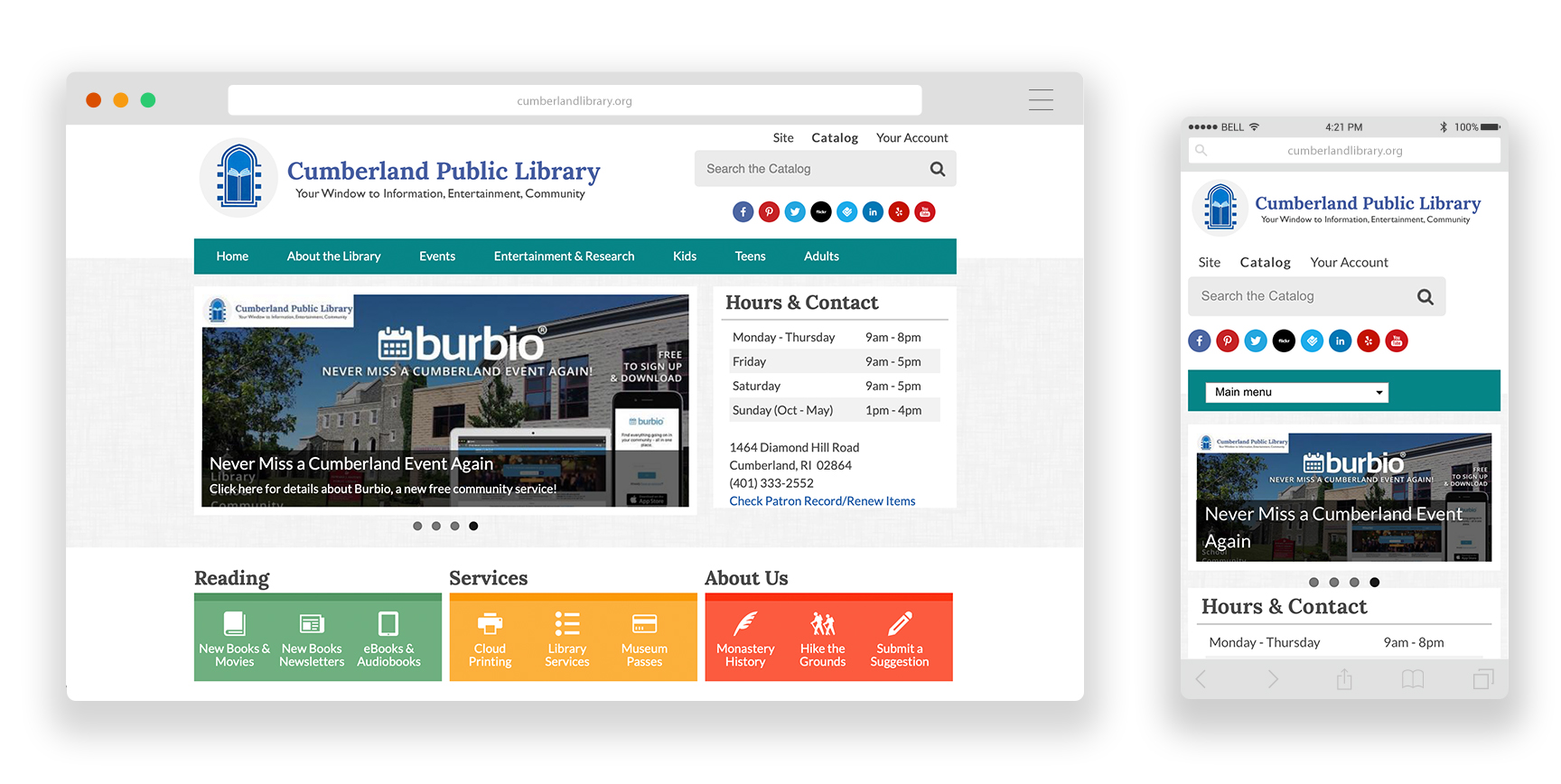
- Bright colors are used appropriately.
- The detailed footer allows users another way to navigate the site extensively.
- The location info. Hours and contact information are prominent and no need for an extra click to access this information.
22. Sacramento Public Library
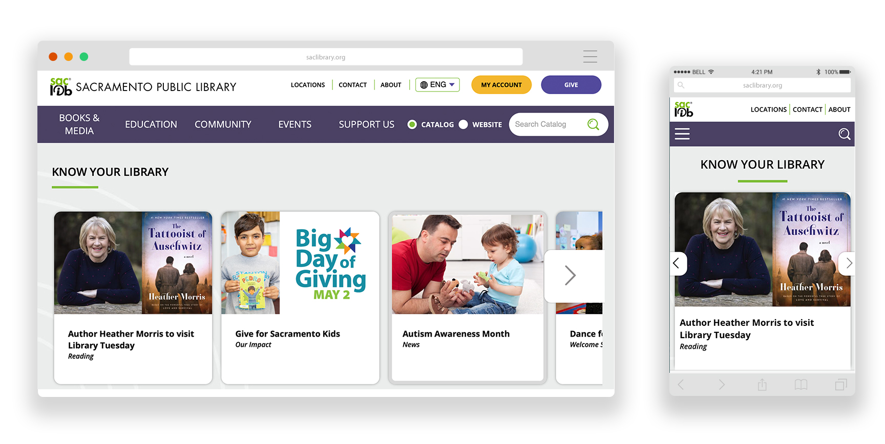
- Clean design which features shorter page lengths that make use of negative space, making it easy to view and use.
- Clear labels in each active mega menu makes for easy navigation.
- The location search allows you to search a location nearest you.
23. Metropolitan Library System
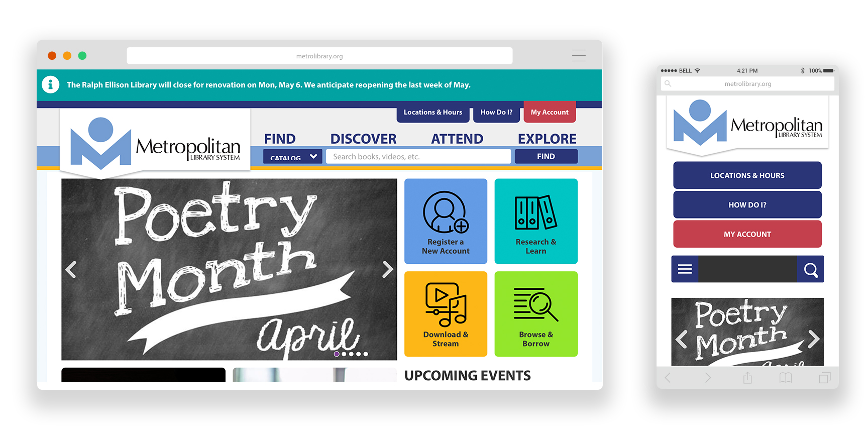
- The location information. There are several branches, so displaying these in a mega menu from the top nav is a smart move to provide easiest access to the right information.
- The events calendar. Use of distinct colors that relate to audience (adults, teens, kids, etc.) makes it easy to see at a glance how individual events are tagged.
24. Clinton Macomb Public Library
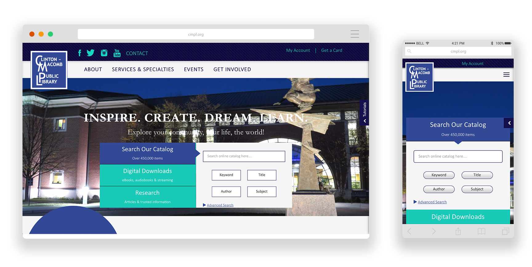
- Bright colors and use of modern patterns and textures.
- Prominent and robust search. Not only can you search the catalog and digital downloads, but also search directly in research/academic databases.
- The sidebar for tutorials that slides open and close for whenever you want to access them.
25. Evanston Public Library
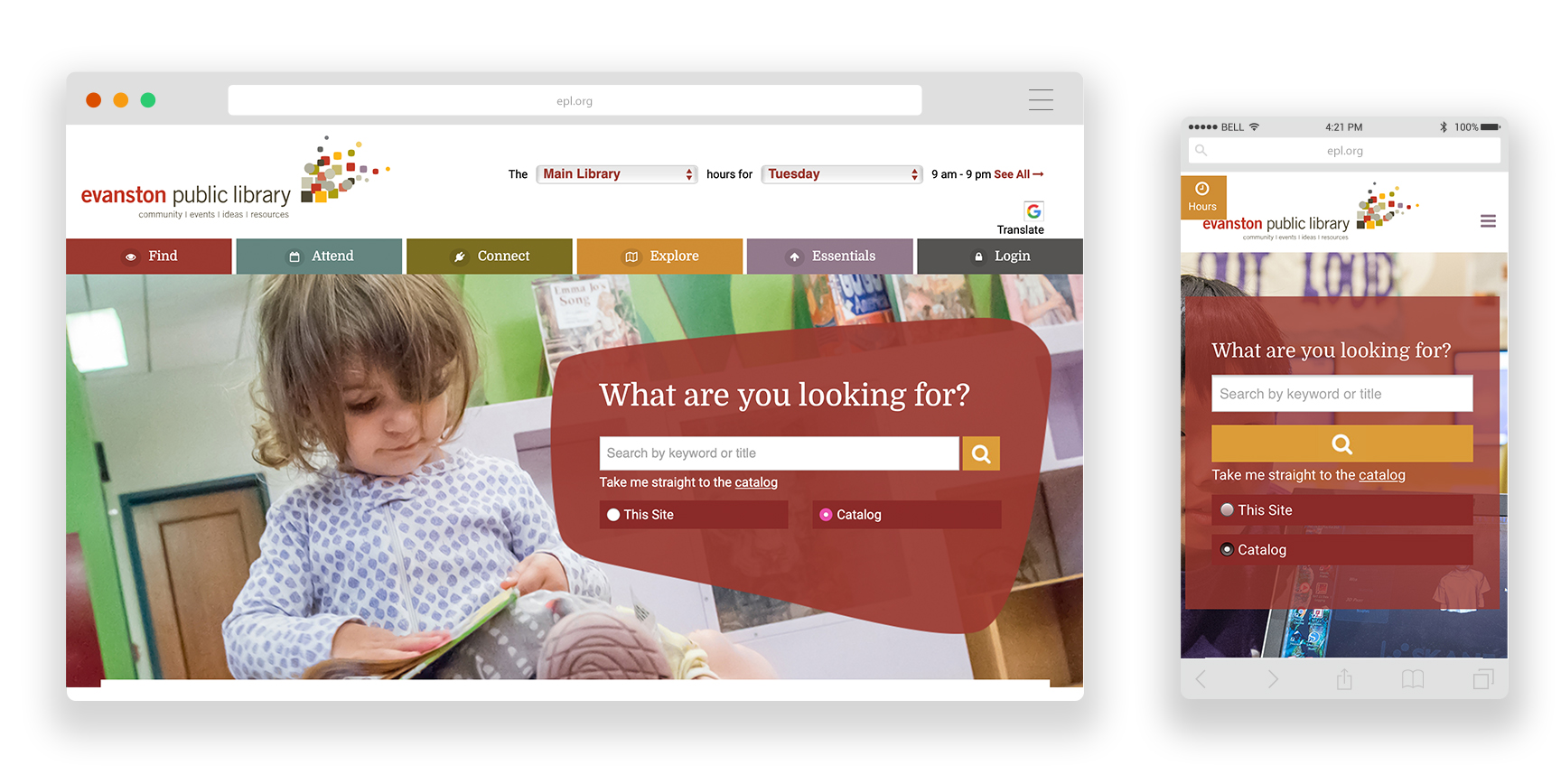
- Use of colors to distinguish between main menu items helps you focus on each one, especially on desktop.
- The main nav is sectioned into different tabs, each with a relevant icon. We love icons! Making content visual wherever possible is a great way to help users navigate a site with ease.
- Their mobile app and a page dedicated to download instructions and benefits of using the app.


Thank you for the inspiration!